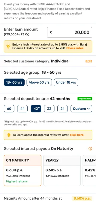
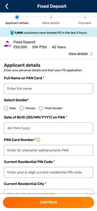
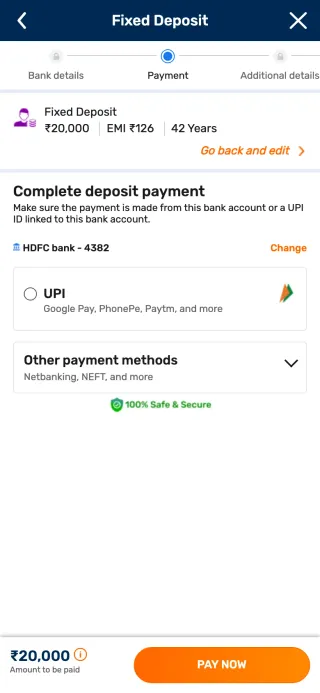
BFL Website Redesign
The site gets 24.3M visits a month. I looked for where people gave up, and fixed what made them leave, one problem at a time.
Fixed Deposit 5 million+ depositors
Interest rates up to 8.65% | 100% digital process | Rated AAA (stable)
- Tenure
- 12 months
- ROI
- 7.80% p.a.
- Tenure
- 36 months
- ROI
- 8.00% p.a.
- Tenure
- 42 months
- ROI
- 8.65% p.a.
Enter deposit amount (Min.: ₹15,000) and select the tenure
Where they left
A site this big loses people in small places.
Six products, 24 journeys, three of us. Redesigning it all wasn't possible, so instead of asking which pages looked old, I asked where people left. The analytics showed people dropping off in many places across the site. We found the specific problem behind each one and worked through them one by one.
FD form · mobile verification
- 86.2%exited the form
- 8.1%went on to get the code
- 5.7%went elsewhere
FD form · average time on form
Finishing took 17 minutes. People who quit left before 4.
FD · conversion by device
Most traffic came from phones, where a visit was a tenth as likely to end in a deposit.
Customer portal · the five-step login
More than a third of the people who started logging in never got in.
The constraint
Leadership wanted payment first. I designed around it.
This case follows one of those problems: the FD (fixed deposit) journey, which came with a constraint from leadership. The old journey asked for everything before taking any money. Payment came at stage 10, and 82% of people who reached it dropped off there. To win small savers, leadership set one rule for deposits up to ₹25,000: take the money first.
Before · 10 stagespayment at 10
- 1Investment details
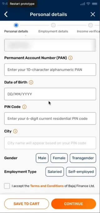
- 2Personal details
- 3Primary holder KYC
- 4Email ID
- 5Income & declaration
- 6Joint holder & KYC
- 7Nominee details
- 8Bank verification
- 9Summary & T&C
- 10Payment
- ✓Thank you
After · 7 stagespayment at 3 · four stages after it
- 1Investment details
- 2Personal details, prefilled
- 3Payment
- 4Income & declaration
- 5Nominee details
- 6Joint holder & declaration
- 7KYC appointment
- ✓Thank you
To make that work, I sorted every field by why we were asking for it.
- Before paymentThey chooseAmount, tenure, payout. Now on the product page.
- After paymentThey may shareNominee, joint holder. Optional.
- After paymentWe must ask by lawKYC (the identity check) and declarations.
Choosing
Choosing an FD went from 49 seconds to 13.
With payment at stage 3, choosing had to be quick. Before building anything, we tested four product pages (PDPs) with 110 people. The winner put three ready-made options up front, with a custom field beside them.
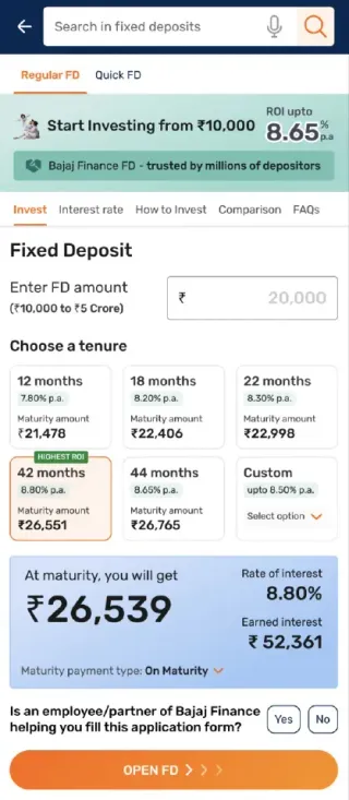
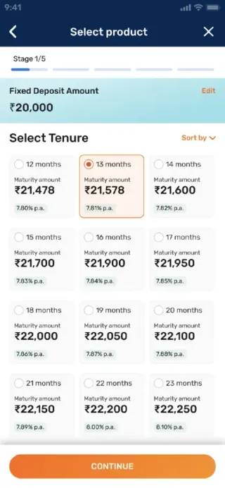
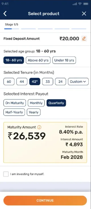
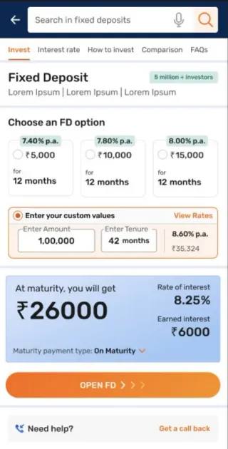
| Measure | PDP 1 | PDP 2 | PDP 3 | PDP 4 |
|---|---|---|---|---|
| Task success | 71.7% | 79.1% | 86.7% | 88.9% |
| Average time | 49.1s | 46.5s | 27.8s | 13.2s |
| Found the highest rate easily | 57% | 86% | 68% | 92% |
The new problem
Once people paid, they thought they were done.
Paying feels like the end. With payment at stage 3, four stages still stood between the customer and a booked deposit, and our prototype test showed how few people knew it.
knew the steps after payment had to be done within 10 days
knew their interest had started on the day they paid
The tests
I A/B tested the tone of the screen after paying.
Payment couldn't move, so I worked on the screen right after it. We ran A/B tests (versions shown to different visitors, then compared) on how much text, which colours, and what the message said.
Tone decided it. Red warnings worried people, and worried people stop. A big success screen told them they were finished. The version we kept read as routine: money in, interest running, two short steps left.
Calm over loud
Chose
A plain status on every screen after payment: money received, interest started, what's left.
Gave up
The loud warning. "Finish in 10 days or get a refund" stays, in one quiet line.
Because
In the tests, worried people stopped. Settled people went on to finish.
Paid. Now, how should it feel?
Payment happens at stage 3 of 7. Four tested versions of the next screen, and how each one reads.
Pick a version
Same moment, same ₹25,000. Only the words, the colour and the length change.
Your FD is not booked
Payment received, but your deposit is NOT confirmed. Complete all pending steps within 10 days, or your application will be cancelled and the amount refunded.
- Income details pending
- Nominee details pending
- Joint holder details pending
- KYC pending
Payment received
What happens next
Your payment of ₹25,000 has been received. To book your deposit, complete your income details and declaration, nominee details, joint holder details and declaration, and KYC, through DigiLocker or a scheduled visit.
All pending steps must be completed within 10 days of payment. If they are not, the booking will not be made and the amount will be refunded within 7 working days, without interest.
Interest is calculated from the date of payment. If that date falls on a banking holiday, the deposit will be booked on the next working day. Your Fixed Deposit Receipt will be emailed once the deposit is booked. Form 15G/H can be submitted now or later.
Thank you for investing ₹25,000 with Bajaj Finance.
Complete your application
Your interest has started.
Two short steps and your FD is booked.
- PaidToday
- Your detailsIncome and nominee
- KYC visitPick a time that suits you
- FD bookedReceipt within 10 minutes
Finish within 10 days to book it. If you don't, we refund the full amount.
How it reads
Four stages still to go after this.
Income · nominee · joint holder · KYC
- Words
- —
- Red marks
- —
- Next step
- —
Errors
The quietest exit was an error nobody saw.
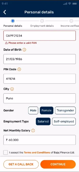
On the loan forms, people pressed submit 4.2 times on average. The error messages were there, scrolled out of view. Now submit jumps to the first error and shakes the field.
attempts per user to submit a loan form
error rate
Hindi and Tamil
Hindi takes 1.2× the room. Tamil takes 1.5×.
Many customers read best in their own language, so the site went into Hindi and Tamil. The same sentence runs longer, and every component built for English had to hold it. We tested with 10 Hindi and 10 Tamil readers, then reworked headings, tiles and buttons to fit.
- Approval in 5 minutes
- 24-hour disbursal
- No collateral
Need help in choosing the right Personal Loan?
- Actions are translated.
Know More
becomesअधिक जानें
. - Familiar words keep their English sound.Apply, Login and Payment are spelled out in the script:
अभी अप्लाई करें
. - EMI, KYC and CIBIL stay in English.Customers already know them that way.
- Fonts matched to Rubik, the site's font.Baloo 2 for Hindi, Mukta Malar for Tamil.
The result
Four years of small fixes added up.
conversion across the redesigned journeys, with traffic up 23%.
- Journeys mapped
Across products; the credit-card form audited screen by screen.
- FD form analysed · HEROES award
17 minutes to finish, 86.2% exit at mobile verification.
- Customer portal mapped
106.2M homepage visits; 62.6% finished the five-step login.
- Forms
Attempts per user 4.2 → 1.4, errors 32% → 12%.
- Hindi and Tamil
The site in two more languages.
- FD payment first
Product pages and the screen after paying, tested.
- Coded prototypes
The site in code: three builds, about 190 pages each.
“Exemplary work on digital journey design for various businesses.”
HEROES award citation, Bajaj Finserv, April 2022
Also in this work
I led a cross-functional team, took apart the pages of Groww, a leading rival, and set rules like “transaction first, then onboard”.
2024 · bajajfinserv.inOne in four phone visits to the branch finder waited 10.6s or more. My A/B test loaded only the branches in your state.
A/B test · branch pagesIn a test of Bajaj's local-shopping app, 9 of 10 people chose the busier version. To them, simple meant familiar, not empty.
User test · local-shopping appThree builds of about 190 pages each, 21 calculators and every form state, so reviews happened in a browser. How we worked is in Building the DCX team.
Feb–Jun 2025 · HTML, CSS, jQuery